Nowadays, it is difficult to even imagine doing business without collecting and analyzing data. We gather information from different sources and detect patterns and trends. Better yet, we can interpret what these mean to our business.
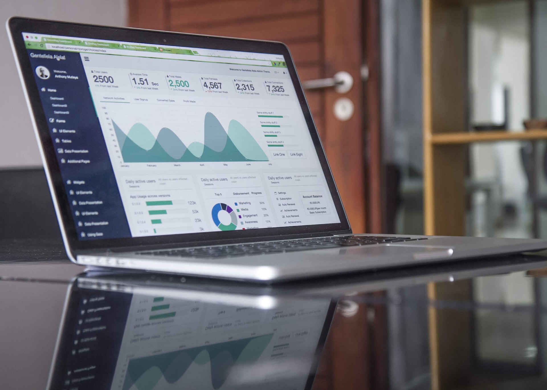
This makes data visualization tools more important than ever. They provide information context and present it to us in graphs and charts.
Everything about data visualization tools is designed with comprehension in mind. Trends are easy to identify even in larger data sets.
Do You Need A Data Visualization Tool?
The answer is simple – you do. The career or the business doesn’t matter. Data visualization will help you be way more effective with anything you do. The business intelligence operation begins by collecting raw and modeling raw data.
Next, it goes into delivering comprehensive and instructive visuals through a WordPress tables plugin or whatever tool you find best for you. The more advanced the tool, the more powerful the machine learning algorithm behind it.
That trend is not difficult to spot at all – information is only becoming easier to interpret. Another trend to observe is that data visualization tools are faster and more standardized every day.
Companies build realistic expectations out of them. They identify areas for improvement or customer satisfaction or dissatisfaction.
They can even break the math down to specific products and services and enable any stakeholder out there to make the right sales decision.
How Will This Tool Help You?
Organizations report a very positive impact from using data visualization tools. They make smarter decisions and understand data better with interactive visual representations.
At the end of the day, the pictorial and graphical forms help identify patterns way quicker than ever before.

Here are some of the specific benefits:
Relationships And Their Correlations
If you don’t have a visualization tool, it is very difficult to recognize the correlation between independent variables. Isolated from each other, these variables hardly make any sense, and it is impossible to take a 100% valid business decision.
Trends, Patterns, And Their Frequency
This is the most important use of data visualization tools. All information in one place helps make accurate predictions, as you know what happened before and whether it repeated itself. Recognizing a trend over time reveals in which direction we are moving.
At the same time, data visualization tools examine the frequency of different events. For instance, they can reveal how often customers buy a product, or when they are most likely to react to a particular marketing strategy.
Market Knowledge
Data visualization tools can gather information from several different markets. Also, they can provide valuable insights based on it.
The key takeaway would probably be on which markets to focus on and which ones to leave away. The better the tool the clearer the picture, especially if you like working with graphs and charts.
Risks & Rewards
How did you interpret your value-and-risk metrics before data visualization came along? Probably the same old-school way as everyone else: with daunting spreadsheets and charts. Nowadays, it is really easy to depict and pinpoint issues that require our action.
Reactions To Market Trends
Since you can get information in a reasonable time, you can also act quickly and respond to the market challenge as swiftly as it may be. Data visualization tools come with beautiful and functional dashboards, and they ensure you won’t make any mistakes.
Which Are The Best-known Data Visualization Techniques?
There are multiple methods to combine and display information in the needed visuals. It depends on the data you are modeling and its intended purpose.
You can design graphs, charts, tables, or even interactive dashboards. Some apps create automated visualizations, while others ask you to create the manually.

Infographics
Instead of single data displays, infographics combine lots of information into comprehensive dashboards. You can use them for more subjective and complex topics.
Heatmap Visualization
With this method, you can create numeric graphs with high-value and low-value data points. This method not only displays, but also interprets information. It operates on the premise that humans understand colors much better than letters and numbers.
Fever Charts
Fever charts also work with colors, and they display how data changes in a given period. They are foremost used as marketing tools.
You can apply them to compare performance over several years, and even make accurate projections for the future. The charts can combine multiple data sources and can interpret different types of information.
Graphs & Area Charts
This is another tool that helps visualize and understand data over time. For example, you can compare the earnings of different departments month by month, or test the popularity of your products for each year.
Histograms: If you want more than to explore time trends, try histograms. These tools also measure frequencies. They apply a special automated data visualization formula to distribute and interpret data.
Whom Is Data Visualization Made For?
With proven efficiency, data visualization programs got introduced to all industries. They are the leading tools when it comes to increasing sales and targeting new customers and demographics. In 2020, companies spent over 50% of advertising dollars online, which made web data even more important.
Thanks to data visualization, companies acquire critical insights into their untapped information. This enables them to perform better and make smarter decisions. There is no place for daunting spreadsheets in the modern market – instead, there are tools that identify patterns on their own.
Final Thoughts
Data visualization tools help collect, organize, and exploit huge amounts of raw information. Assembled in Excel sheets, this information wouldn’t make sense to the human brain. This way, we can understand and use our insights, and pinpoint trends that can improve our business operations.
Ella Marcotte
Latest posts by Ella Marcotte (see all)
- UA vs GA4: The 4 Big Differences You Need To Know - April 8, 2024
- Understanding The Role Of Control Valves In Industrial Automation - April 8, 2024
- How Automation Can Boost Your Business Outcomes - April 4, 2024